Taking a good headshot goes beyond just taking a regular picture. It’s an authentic representation of who you are, capturing your personality in a way that reconnects with those you aim to connect with.
In that case, choosing the right color for your attire in the photo is integral to effectively representing your professional identity. Considering these factors, the question of what color is best for headshot photos arises.
Basically, neutral tones like cream, taupe, or cappuccino are best for headshot photos. These colors complement various skin undertones. For cool skin tones, navy, gray, or jewel tones enhance features. Avoid bright colors or busy patterns to draw attention to your face.
We will discuss more tips on capturing the perfect professional headshot through this content.
How Important Is Color To Professional Headshots?
Color plays a major role in professional headshots because it significantly influences how you are perceived. Choosing the right color for your clothing ensures that the focus remains on you, not what you’re wearing. Neutral colors like grays and blues are often recommended because they look great on camera and complement most skin tones without distracting.

In headshot photography, especially in a fast-paced business region like Bangladesh, the right color can also reflect your industry and personal style. It effectively communicates professionalism and reliability. For instance, darker tones represent seriousness and are suitable for more traditional sectors, while brighter shades might be more appropriate for creative fields.
In that case, taking the help of a headshot photography service in Bangladesh can guide you through selecting colors. This will enhance your natural features and align with your career goals. This customized approach ensures that your headshot looks professional, authentic and engaging, making a strong first impression.
What Color Is Best for Headshot Photos?
Color is a powerful way to draw attention to your professional image in a headshot photo. Often, we overlook this aspect, but the color you wear in a headshot reflects your personality and the professional message you wish to convey.

While there’s no one-size-fits-all answer, certain colors consistently work well by increasing features and ensuring the focus stays on you, not your clothing. Here are the factors to consider before opting for a color in your headshot photo.
Skin Tone Compatibility
A good-looking headshot requires choosing a color that compliments your skin tone. If you have cool undertones in your skin, opt for colors like blue, gray, or even jewel tones. These colors can highlight your features without overpowering them.
Conversely, for warm undertones, stick to earth tones, such as greens, browns, or warm blues. These tones harmonize beautifully with your skin and offer a warm, comforting presence in your photo.
Background and Setting
Consider the background against which your headshot will be taken. A professional headshot photographer suggests colors based on the backdrop and lighting conditions.
For a lighter background, dark colors like navy or charcoal create an eye-catching contrast that makes your image pop. For darker backgrounds, lighter shades such as light blue or cream can prevent you from blending into the background. This will help maintain the photo’s focus on you.
Industry Appropriateness
The industry you are in should also influence your color choice. In more conservative fields like law or finance, traditional colors such as navy, dark gray, or black convey professionalism and formality. These colors are safe choices that maintain a polished look.
For those in creative industries, such as marketing or design, you have more leeway to incorporate bright colors. A pop of pastels or vibrant shades can reflect your creativity and make your headshot stand out. However, regardless of the industry, avoid overly bright colors and busy patterns that might distract from the main focus of the headshot in your face.
The capturing process of professional headshots involve more than just showing up and smiling at the camera. It requires thoughtful preparation, from choosing the right attire to selecting the appropriate backdrop and lighting.
As you know from the above text, the best color for your headshot depends on many factors, such as your skin tone, industry standards, and the environment. By considering these elements and working with a skilled photographer. You can ensure that your headshot is not only professional but also a powerful part of your personal brand.
Headshot Photos: How To Align Colors With Impression?
Color selection is essential for making the right impression in your headshot photos. It’s not just about looking aesthetically appealing; the colors you choose can convey personality traits and professional qualities. So, here are some tips on how to align colors with the impression you want to create, so that your headshots reflect you as a person.

Step 1: Choose Your Color Palette
To start with, think about colors that complement your skin tone. Cool skin tones shine in blues and grays, while warmer tones look gorgeous in earthier colors like greens and browns. This choice ensures that your features are enhanced rather than overshadowed by what you wear.
Step 2: Considering Industry Norms
Following that, consider industry norms. In sectors like banking or law, subdued colors such as navy or dark gray suggest seriousness and professionalism. Creative fields allow you to go bold with colors that express creativity and innovation.
Step 3: Setting and Background
Furthermore, consider the setting and background of the photo. If a headshot photographer in Bangladesh handles your session, they’ll likely advise on colors that stand out against the chosen backdrop. Light backgrounds work well with darker colors for contrast, and vice versa.
By carefully selecting colors, considering industry expectations, and coordinating with your photo’s background, you can create headshots that aren’t just visually appealing. They are also perfectly aligned with the professional image you aim to project.
Tips for Avoiding Some Color Pitfalls for Headshots
When getting ready for a headshot, picking the right colors is extremely important. It’s easy to fall into traps that detract from your photo’s professional quality. Here are some key tips to avoid common color pitfalls in headshots:
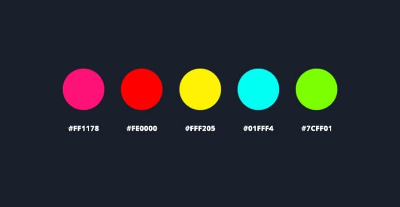
- Avoid Neon Colors: They can cause color casts on your skin, making editing difficult.
- Steer Clear of All White: It blends into the background and wash out your complexion.
- Be Cautious with Black: It might absorb too much light and obscure details in your clothing.
- Say No to Busy Patterns: Patterns distract from your face.
- Skip Shiny Fabrics: They reflect light and create unflattering highlights or change photo tone.
- Watch Out for Red: It’s a powerful color that dominates the photo and overshadows your facial expressions.
These tips will help you choose colors and fabrics that will enhance your headshot. This will ensure it looks professional and accurately represents your personal brand.
FAQs About What Color Is Best for Headshot Photos?
Headshots are a critical component of your professional branding, essential for making a strong and positive first impression. Here are some FAQs to guide your choices.
Should Headshots be White Or Black?
Headshots can be in black and white; this classic style emphasizes features without the distraction of color, often reflecting a timeless professionalism.
What Color Background is Best For a Professional Headshot?
Neutral backgrounds like white, gray, and black are best for professional headshots. These colors prevent distractions and focus attention on you.
Is Black a Bad Color for Headshots?
Black is absolutely acceptable for headshots. It’s a versatile color that emphasizes formality and sophistication, though make sure it doesn’t blend into a similar dark background.
What Makes a Bad Headshot?
A bad headshot typically suffers from poor lighting, like harsh shadows or bright spots. This can create an unflattering and unprofessional appearance.
What Color Shirt is Best for Headshots?
Solid colors like blue or gray are ideal, as they complement most skin tones and emphasize professionalism without being distracting.
How Do Bright Colors Affect Headshots?
Bright colors should generally be avoided as they can overpower the face and distract from the person’s expression and professional demeanor.
How Does Fabric Choice Affect Headshots?
Choose matte fabrics over shiny ones to avoid reflections that might distract from your face. Matte fabrics present a clean, even look.
Conclusion
Color is paramount to capturing a headshot that perfectly reflects your professional self-image. When pondering “What color is best for headshot photos?”, consider how different shades can increase your features and align with your industry’s standards.
Make a choice for neutral tones like gray or navy to reflect professionalism, or select soft pastels for a touch of personality without overwhelming the viewer. Solid colors typically work best, avoiding busy patterns and overly bright hues that can distract from your face.